With the release date to my upcoming book, Sex Positivity vs Sex Coercion, or Gothic Communism, drawing near (on Halloween!), I decided that I should finally design my own logo for Gothic (gay-Anarcho) Communism. Included in this post is the logo itself (and the always-awesome Blxxd Bunny), as well as a brief history of its recent inception and cannibalized source materials:
Update, 3/5/2025: My book series is entirely out except for the final volume, Volume Three (which I plan to release by June). Apart from the one-page promo for the book series, I have several other pages for paratextual material about the series: Click here to access the project's most vital Gothic paratextual documents; e.g., its main Gothic keywords, but also theories and central tenets, which aren't contained in this glossary. Click here to access the non-Gothic paratextual key terms, as well as information about the series’ intended audience and reading order.
Update, 11/5/2023: My book has been divided into four volumes; there are no concrete deadlines, but the volumes are being released numerically (from 0 to 3) throughout the remainder of 2023 and all of 2024. The good news is that of 10/8/2023, the first volume—my thesis argument—is now live! Go to my website's 1-page promo and pick up a copy for free (it's non-profit). While you're there, you can also learn about the other three volumes, project history and logo design (the last being verbatim what's posted on here). This volume is easily the hardest thing I've ever written, and I'm very excited to share it with you all! If you like it, please share it with your friends and let me know what you think! —Perse ~xoxo <3
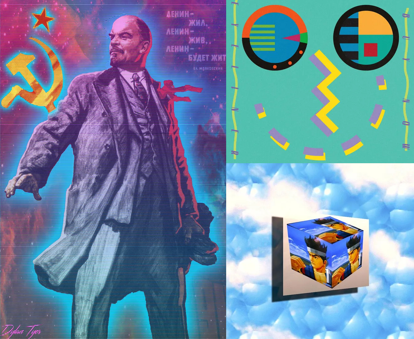
For much of this book's construction, I was using the Laborwave
hammer and sickle insignia over a red-and-yellow cover to represent the book's
concept of Gothic (gay-anarcho) Communism. However, I decided on 8/26/2023 to design,
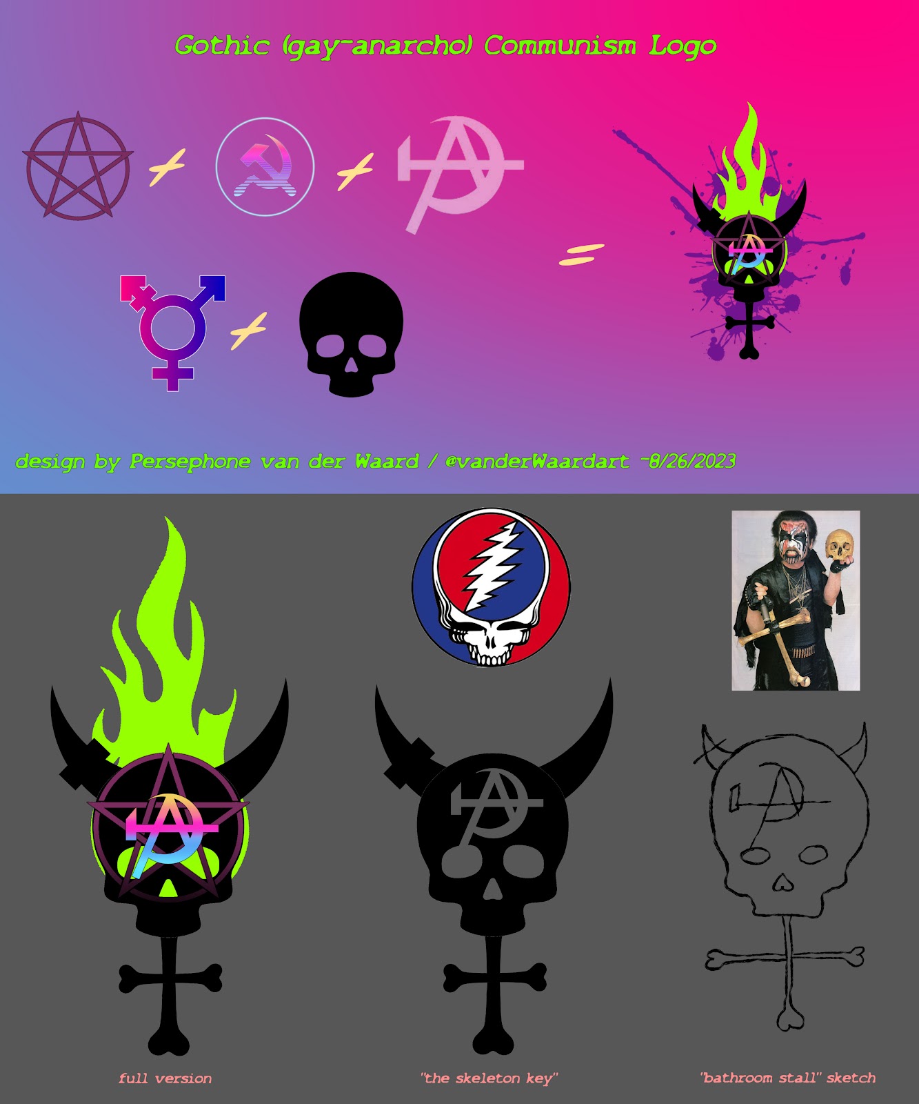
thus give, the ideology its own symbol (the full PNGs for the Gothic [gay-anarcho] Communism logo by itself—with three different versions [full version w/flame and w/o flame, and the "skeleton key" simplified version] are available on my DA Stash).
Galletti; top-right: Eyeliner;
bottom-right: Esprit
空想
[Esprit Fantasy])
When crafting my own symbol, I wanted to progress further
beyond the Vaporware aesthetic (which
emerged in roughly in 2011) than Laborwave had, which, in
2016, combined Vaporwave's signature corporate mood/neoliberalism-in-decay
with Marxist-Leninist icons divorced from their historical-material past. I
wanted to not simply reflect on corporate/neoliberal fallibility and decay
within dead/dystopian postpunk-tinged nostalgia, nor wax nostalgic on the
undead pastiche of Marxist-Leninism, but inject a Gothic-queer presence to
evoke an anarcho-Communist potential towards ending Capitalism Realism in the eternal
drive towards developing Communism.
So I took the iconic hammer and sickle, found an anarcho-Communist
variant with the same nostalgic/trans color scheme, and embossed a skull with
it over a Wiccan pentacle; the skull I treated as the circle of the transgender
symbol, fashioning it from black bones and horns (to symbolize the undead and
demonic of Gothic poetics fused with the aesthetics of power and death; i.e.,
the green flames and purple slime as reclaimed colors of canonical stigma and
persecution). If I was going to simply it, I'd thought I'd lose the flames and
pentacle, turn everything black, and make the an-Com symbol negative space in
the forehead. The thought process was, I wanted the embellished version for the
book cover (like a monk's monasterial tomb) to give it a thoroughly
medievalized flavor (the embossed codex). But as part of a logo guide, I
included the simplified version of the symbol simply called "the skeleton
key." I thought about using just the "A" in the forehead or the
hammer and sickle, but that verges on too simple (the "A" being for
Anarchism and the hammer and sickle being for Communism); so I went with the
more complex an-Com symbol to preserve its meaning. That + the skull and
crossbones + the horns + the trans icon = Gothic (gay-anarcho) Communism. It
can be drawn all in black with a simple marker in a simplified "bathroom
stall" form, but also has a fancier black logo that can be further
embellished with ornaments and color if needed. Also, completely by accident,
it kind of reminds me of Mercyful Fate's Melissa skull + the Grateful Dead
logo, the latter being one of the most famous counterculture rock 'n roll bands
of all time: sex, drugs and rock 'n roll all in one package!


