With Doom Eternal's (2020) release so close, I wanted to write about Doom in general. This piece critiques a two famous "mods" in the Doom community: Brutal Doom, and Project Brutality (B&B). At times I wish they had vastly different titles to help distinguish them. As to the exact differences between them, I'll let someone else explain.
What matters, here, is their general purpose: to "improve" the classic experience by making the Doom games harder, faster, and... prettier—a worthy goal, but also where my complaints mostly lie. Having tried Project Brutality back in 2017 I remember enjoying it, largely because the build I was using—whether through its own status of incompletion or my inability to install the more dubious aspects—was generally in the graphical style of the original Doom engine. This means pixels; so no particle effects, transparency or motion blur, etc.
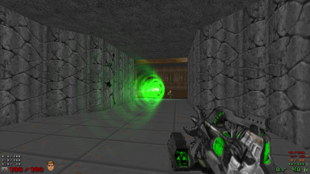
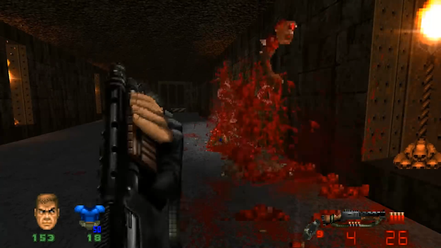
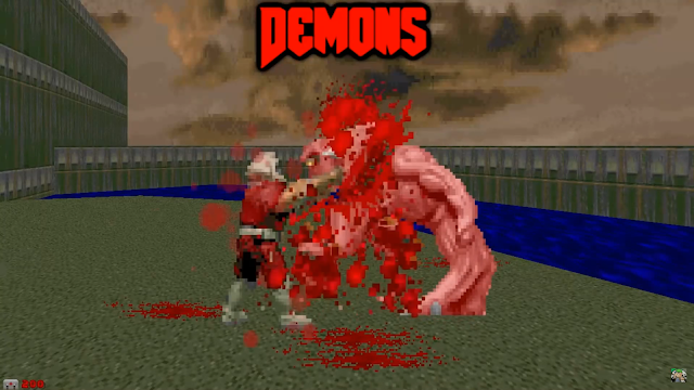
One problem I have with B&B is their current treatment of projectiles, gore and explosions. The monsters and levels are largely what they were in 1993; they are still pixelated, with the same color palettes and artistic approach, albeit with added animation frames. However, the projectiles, gore and explosions they produce have much more detail than would've been possible twenty-seven years ago. As a result, the ensuing carnage resembles something closer to Doom 64 (1997) or Disruptor (1996). It's a bit uneven.
To their credit, B&B are extremely customizable, allowing the player total control over what they decide to modify. If you dislike a particular aspect of the mod, you can simply disable it. The point here is to critique the inclusions themselves and what effect they have on the classic Doom experience.
Doom is a game whose source code has been available for decades, helping foster its longstanding modder-base. The simplicity of the game's visual design allows for an endless series of simple "reskins":
However, its malleability lets the more dedicated peek under its hood, allowing them to seriously alter the game's look and feel—the irony being that the zeal for added glitz and polish sometimes hampers the overall experience. It's not that I tout the classics and nothing else; it's a question of clutter. Visual polish aside, B&B's projectiles are transparent. Honestly I feel there's no real advantage to this. You'll know what you're fighting based on the projectile, and there's no need to gauge distance because there's no damage fall-off. This is Doom, not Overwatch (2016).
As your eyes try to see through what's flying towards you versus looking at the object itself, the projectiles become distracting. You should not only be able to see them, but also—ironically enough—be able to see what threw them at you (when movement allows) in a way that isn't visual smoke. These components cause me to stare even harder, while the projectiles become eyesores; instead of being at home in the gameworld, they invade it and the screen.
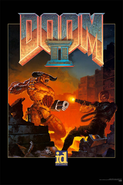
I suspect this "modernized" approach attempts to increase the visual fidelity of the gameplay to better match the box art. And while Doom featured polygons, they were of the most basic sort. Anything that actually moved was a 2D sprite, including the projectiles. To see modders introduce motion through objects other than sprites feels incongruous. As iconic as it is, Doom remains heavily dependent on its own visual style being tied to its ancient graphics engine. In other words, you can introduce new images for the projectiles, but the level design can't feature true 3D. Doom's technological limits cause its levels to look a particular way and these can't be changed short of altering the base nature of the game and how it plays. Mods like B&B largely alter the look of what can be safely changed inside a "classic" Doom experience.
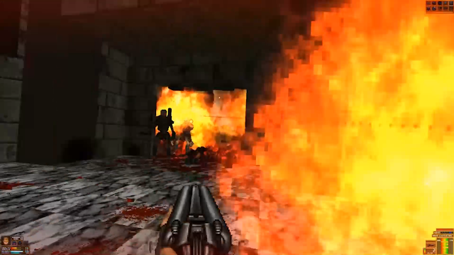
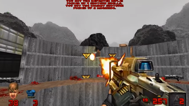
Regarding the visual "eyesores" previously mentioned, a Doom champ of the modder school might say, "Once you get moving, you'll barely notice!" But my argument still stands. Watching B&B being played, I can't see through the visuals-in-motion, because movement makes them dense. Fast movement and arcade-style action are in line with classic Doom. Even so, fast movement in these older games doesn't scramble the image; no matter how fast Doomguy moves, there's no such thing as motion blur in his world by which to obscure what we're seeing onscreen. B&B introduces a plethora of venues by which to make clear visibility a thing of the past.
The original Doom had a good balance of things to see (shoot) and movement speed. Doomguy moves akin to a violent ghost: He glides over the smooth, 2.5D floors, blasting everything in sight. Whatever his speed, it's almost impossible for the game, by design, to be visually confusing. No matter the number or variety of monsters you square off against, there's never a point where the horizontality of the experience is a detriment. You simply move and shoot until everything is dead. The monsters line up in rows; you shoot them and they fall over. It's frantic, but visually clear.
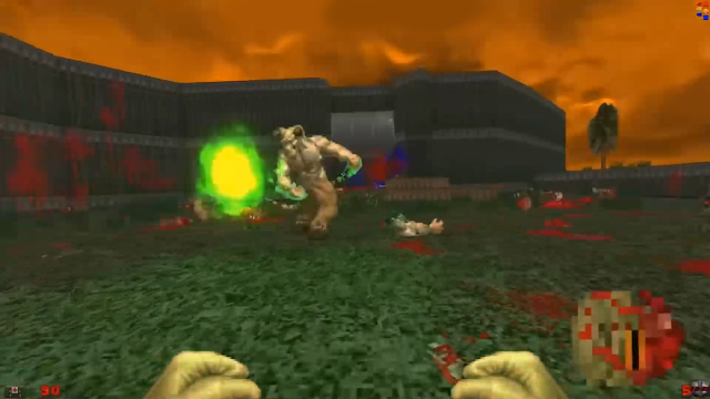
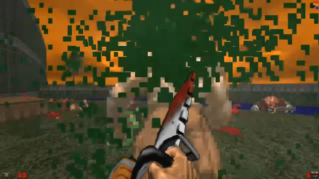
In B&B the screen becomes cluttered with too much information. There's more blood, projectiles and monsters. This might seem like a good thing until there's too much to see, so much so that you can't make heads or tails from any of it:
And while a Build engine game like Blood (1997) might boast the same potential (read: lots of gore and explosions), it was also designed from the ground up with this in mind. The artists intended for these factors to work comfortably within the screen as something controlled by the player inside a Build environment.
Doom and its worlds were designed with less clutter in mind. The way Doomguy controls when steered by the player is distinct from the Build engine heroes, as a result. This distinction occurs within Id Software's game engine. Because B&B functions within this engine, they must operate according to its rules. This includes the visual limit these worlds can comfortably afford. You can exceed it, of course, but this causes problems. A Doom level is rendered in a particular manner, one that B&B can't change. They also can't introduce further mayhem without risking clutter by virtue of what they're working inside.
This clutter is combat, and combat is established by motion. With Doom ports being available on Steam, modern control schemes have only enabled players further autonomy over Doomguy through the inclusion of mouse control and keyboard customization. There are no set keys, and the optimization of which can be pressed along with mouse aim makes the combat faster than ever. With the classic, unmodded engine, it's surprising how well this holds up. It feels like a race, to be sure, but it never melts into kaleidoscopic anarchy.
However, the moment you start to introduce more visual data than was intended within the scope of the original gameworld, things spiral out of control. It's not a question of visual style, but rather the graphics responding to a player who ultimately controls how things play out. It's like putting too much snow in a globe. If it's the right amount, no amount of shaking can fully-occlude matters. If there's too much dust, then the slightest touch can obscure what you're actually meant to see. It becomes a visual mess.
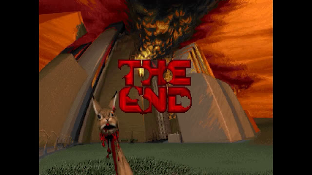
The irony is, despite its built-in limitations, current modders are working within the Doom engine to try and recreate its "true look." Think the box art, or in-game cutscenes:
While these images look far fancier than the actual gameplay, to try and recreate them takes the game in a direction outside of what it was meant to deliver when played. You could say the goal of Doom was to kill demons. Really, though, the experience works as well as it does because it's the killing of demons within a particular set of rules: the game engine. Trying to break these rules in favor of an "artistic vision" exceeds what the game is capable of actually performing.
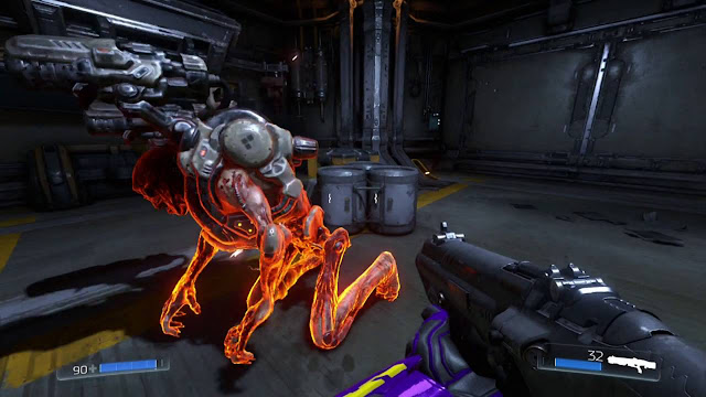
Consider glory kills. Doom 2016 introduced these, which rapidly became a fan favorite:
B&B allows classic Doomguy to glory kill his enemies, too. Having glory kills in a classic Doom game might seem novel, but it also exposed a particular limit of the visual style seen in 1993. The character models were rotoscoped clay figurines. Thus, it looks understandably bizarre to see them given extra frames of motion or abilities beyond what the technology allowed back then. In my mind, it's the equivalent of seeing Ray Harryhausen's infamous skeletons being able to fight at sixty frames-per-second, while spilling the blood of Jason and his Argonauts with squib effects, cables, and pyrotechnics. That visual hoopla wasn't possible back then, and feels anachronistic.
Furthermore, too much interaction between the audience and clay belies the clay's true nature. Watching Doomguy rip and tear a pinky demon or some other monster myopically frames the experience. Suddenly able to stare at the "golem" squeezing a clay adversary between his mighty fingers, I start to think of "Claycat's Doom." Perhaps that's only fitting. Even so, it takes me out of the experience. So does the fact that there's only so much information the models would be able to impart. If you want to rip out the guts of a demon and have it look genuinely impressive, then Doom's 1993 bestiary isn't quite up to scratch. You'd have to completely redesign them, lest you see them spring to life in a way they were never meant to.
Don't mistake me. I'm all for adding extra frames to a pre-existing animation. But to make an entirely new animation from scratch? From an animator's standpoint, this apes the aforementioned projectiles; if a modder includes too much to realize their perception of Doom's painterly box art, they're left with something that's largely of their own interpretation.
I'm not against players creating whatever they want. But sometimes it feels a bit dorky for my taste. I'm not inculpable, here; but my idea of Doom is something more akin to the PSOne port. As much as I like horror and heavy metal, I never enjoyed slaying the shit out of schlock. To continue my ironic train of thought, I never bought into the "original" version of a heavy metal universe with clay minions to smash into ruddy pancakes. To wax paradox, I like my Doom with a serious edge.
However—and more to the point—I also like my Doom experience coherent. So whether you're blasting baddies to Bobby Prince or Aubrey Hodges, there's the classic visual-clarity-amid-chaos of 1993 that I cherish. And this, at times, is marred by B&B, whose modders do their very best to blow up that poster image of dead Daisy's poor head shoved onto a pike. It was never meant to be anything other than an image at the time.
Technological limitations are important in games just as much as they are movies; in the same sense that Jaws or the xenomorph were made better by what the directors couldn't do, so too does Doomguy benefit from being reeled in. The number of on-screen demons in Doom 2016 was limited to assist in computer performance. But the combat was then modeled around this limitation, resulting in a gaming experience effectively comparable to "speed chess with guns," each demon being a piece on the board. So if you think it's always a good thing to have the means to make that immediate picture in one's head a reality, I'd say "Not always."
Does this mean we can't progress, using new technology to craft a "classic" experience? Absolutely not. But the experience still has to be built from the ground up. This was true with Doom (2016) and it's true with Doom Eternal (2020). Even if these games have subtle, or even overt nods to the classics, they were still raised up to be their own games within their own engines. Yes, Doom Eternal captures the essence of the originals by emphasizing motion and combat, but it also has strategic elements, and other latter-day components.
Watching modders try to "update" classic Doom with new tools and graphics often feels like someone slathering too much clay onto a particular skeleton. The problem is the bones don't change, making the surface seem superficial. As mentioned above, it's entirely possible to remake the "skeleton" and still keep the spirit intact (while also subletting with other gameplay concepts). Modding Doom 1993 won't allow for this, because these mods remain trapped inside the classic Doom engine. While there, they may as well try to do what the original did better than anyone else at the time: visual clarity mid-pandemonium. The same goes for Brutal Doom and Project Brutality.
