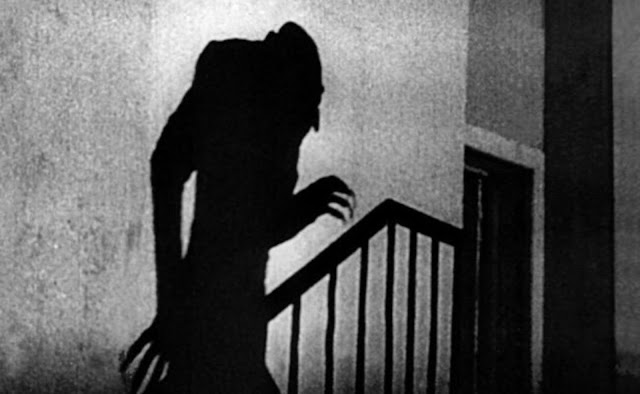
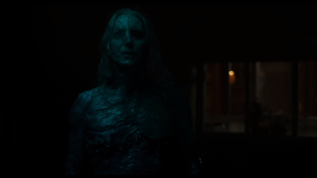
For all the successful tricks that Veronica (2017) borrows from older movies, there are some missteps, too. And Paco Plaza shows enough horror know-how to make one wonder why he made these mistakes, in the first place. For example, one particular visual gag is repeated to the point of being exhausting: seeing the monster's shadow slither across the wall.
On one hand, this is a pretty cool nod to Count Orlok, from F. W. Murnau's Nosferatu (1922). In Veronica, they do the gag three times! By the third, the exhilarating effect is gone, and impatience starts to set in. This issue is compounded by the special effects, themselves. Instead of using actual shadow puppetry like Murnau did, Plaza digitally animates the monster's shadow. The more you stare, the faker it looks, and there's plenty of time to stare.
Another problem is how the movie starts. It opens with a languid, dream-like sequence, with a detective responding to a 911 call. Everything moves in slow-motion. People run past the screen; raindrops practically freeze in mid-air. When the man finally enters the room, he stares with eyes as wide as saucers. Unable to see what he sees, we must wait nearly the entire run-time to discover what. The problem is, our minds have had ample time to conjure up something much worse, by that point.
It's less about that, though, and more about misdirecting the audience. At the end, we're effectively given a parallel to the ritual, at the start: the girl was the monster all along because it invaded her during the eclipse... and was invading her again, at the end of the movie? It's more than a little convoluted, but I've seen worse sleight-of-hand. Then, when we do learn what terrorizes the detective, it's somewhat tame: Veronica, floating in mid-air with her mouth open unnaturally wide. The reason? Unbeknownst to the detective, who cannot see it, the creature's arm is rammed down her throat. All the more ironic, then, that I might have shared in the policeman's dismay had the creature been invisible for me, as well. Seeing the monster or knowing what it is—these aren't even the root of the problem, though; it's the visual effects. To be frank, they suck ass.
The monster effects in Veronica are some of the worst I’ve seen in a movie—on par with Reptile from Paul W. S. Anderson’s Mortal Kombat (1995). The puzzling part about this is how basic the design is. The monster is basically a black silhouette. Given the right approach, Plaza absolutely could've made it work. Alas, a black leotard and ski-mask would have looked better than the computer effects he paid for.
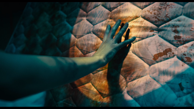
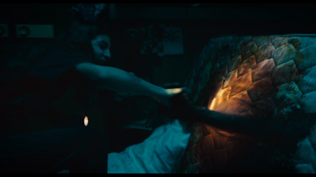
The worst example is probably when Veronica walks up to the upturned mattress. A great deal of time is spent on build-up. Clearly we’re approaching a jump-scare… except, then the camera zooms in on the mattress. The problem is that the entire front of the mattress is computer-generated. Badly. To make matters worse, the camera is pointed right at it, for what feels like a good thirty seconds:
Then, the hand appears:
After it emerges, the black humanoid shape remains computer-generated. I know they were invested in a '90s aesthetic, but was replicating Steven Churchill’s The Mind’s Eye (1990) really the wisest of moves? I began to dread every time the movie segued into another tedious build-up sequence—not because I was afraid, but because I knew what to expect, and that it sucked from a visual standpoint. Suspense-wise, Plaza clearly knows what's up. He also cripples his payoff with horrible visual effects.
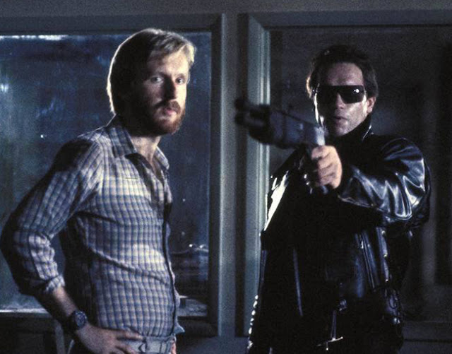
Visual effects matter in this kind of movie. A lot. Think of tension and suspense as a promise of sorts; provided one's intent is actually to show the monster at the end, then visual effects to need to deliver on that promise. If they can't, then discretion is the better part of valor. Just look at Jaws (1975) or Alien (1979). Each is built around a monster one almost never sees. This approach was mostly due to budget problems, in either case, but helped make each more suspenseful. James Cameron also experienced similar budgetary issues when making The Terminator (1984). He originally wanted a liquid metal terminator, but was forced to "downgrade" to one that could be filmed, in 1984. This largely involved the terminator "disguising" itself as a human actor.
It was a genius move; provided Cameron could make Arnold seem inhuman, they could save most of the budget for the big-effects moments. There would be one of these, too, because Cameron had his heart set on showing the monster, "uncloaked." When revealed towards the end of the film, Stan Winston brought it to life with stop-motion and puppetry (techniques that Cameron could afford, with his small budget). The end product admittedly looks dated, but not in such a way as to be considered wholly ineffectual. In fact, stop-motion works rather well in making the terminator suitably machine-like in its movements.
All in all, Cameron managed to squeeze the best possible result out of a micro-budget, while taking a huge risk in showing his creature, undisguised. On the other hand, Plaza—instead of doing the best he could, in a time when special effects weren't up to the task—actually did the worst, in a time when special effects are more than capable of doing the job. His visual effects look so dated, I'm almost certain he made them look that way on purpose.
For all Plaza's horror acumen, he seems to have no idea how to present monsters, here. An effective way to build tension is by hiding something from the viewer. However, if revealed, this same object, as the source of tension, must match the director's intent. This includes whatever level of impact the monster is meant to have on the audience before and after the reveal. Cameron's Aliens (1986) is a fabulous example of this. Clocking in at almost two-and-a-half hours, it saves the queen for the last twenty minutes. Long before that, she is proceeded by tension, and lots of it. Cameron very clearly wants us to feel on edge. However, he also wants to reveal what ails us, while, at the same time, ensuring that each feels appropriate, relative to the other.
In other words, if Cameron wants the queen to feel powerful, then the awe felt in her presence must match to the tension felt in her absence. Otherwise, disappointment is order, or confusion. Since neither fits Cameron's actual intent, he has his work cut out for him. What's especially noteworthy is just how convincing the queen remains, once revealed. Achieved entirely during production, she is a marvel of practical effects, and looks positively massive alongside Lance Henriksen, shortly before ripping him in half.
***
Persephone van der Waard is the author of the multi-volume, non-profit book series, Sex Positivity—its art director, sole invigilator, illustrator and primary editor (the other co-writer/co-editor being Bay Ryan). She has her independent PhD in Gothic poetics and ludo-Gothic BDSM (focusing on partially on Metroidvania), and is a MtF trans woman, anti-fascist, atheist/Satanist, poly/pan kinkster, erotic artist/pornographer and anarcho-Communist with two partners. Including her multiple playmates/friends and collaborators, Persephone and her eighteen muses work/play together on Sex Positivity and on her artwork at large as a sex-positive force. She sometimes writes reviews, Gothic analyses, and interviews for fun on her old blog; or does continual independent research on Metroidvania and speedrunning. If you're interested in her academic/activist work and larger portfolio, go to her About the Author page to learn more; if you're curious about illustrated or written commissions, please refer to her commissions page for more information.
