I’m currently watching the older Halloween movies in anticipation of the latest one, coming out in October. I already watched II (1981), and saw III (1983), years ago. So I decided to move onto 4 (1988), which I’ve never seen, before. This review is divided into two parts; read part two, here. Also, SPOILERS!
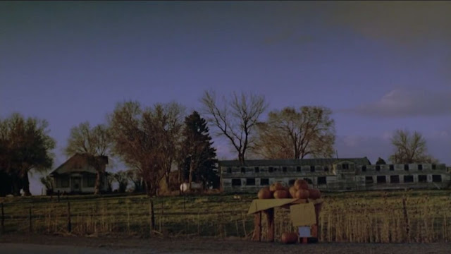
There is a perennial quality to the Halloween franchise, which leads back to an initial trauma: Halloween 4 was made and occurs ten years after the original; H20 (1998), twenty, and the latest, forty(!). 4 clearly benefited from a break, coming back stronger than ever. It's tight and lean, with little to distract us. For a horror franchise with such a famous, immediately-recognizable title track, the opening to Halloween 4 is strangely silent. Instead, an vacant Illinois landscape unfurls through a montage of evenly-timed shots. A derelict farm passes before our eyes in roughly a minute, made all the more empty thanks to the combination of dust and fall leaves swirling in front of the camera. A ghost dangles from a tree like a hanged man; a lonely scarecrow with a pumpkin head sits by himself, guarding an abandoned mill. With every shot, the sky grows darker. There is no sound but the wind; there is no music.
Slow-fade to a winding road at nighttime. An ambulance cuts through the heavy curtain of rain, winding down the slick, wet asphalt before rocketing past the viewer. It’s raining but somehow the air is smoky and blue. When the drivers arrive, they are greeted by a miserable, balding man in a raincoat. The camerawork is tight, with zero cuts. The camera lowers on a crane, starting at such a height as to not permit us to see over the roof. Instead, we see a sign on the front of the building: "Haddonfield Memorial Hospital." When the man waves the visitors through, the ambulance drives off; the camera rises over the roof to reveal a haunted-looking hospital, perched high on a hill in the background. It looks more like a mansion than a modern residence. Maybe it was converted into one. In any case, everything is shot well, and looks the part. This isn't a desultory trek through a dark forest; there’s enough time to both take in what we’re seeing and keep things moving forward with purpose.
The thunder and rain seem to the follow the technicians inside. Shadows and light from the rain-spattered windows reflect on the walls and entrance gate bars, leading into the checkpoint. Everyone makes small talk. Then the wild-eyed guard leads them down into the hospital. It may as well be a dungeon. He makes for an eager de facto tour guide, telling his guests how ghastly the place is without any sense of irony. We can’t disagree with him. It is a forbidding place, a character as much as a set. The ward itself isn’t exactly homely, either. Steam leaks from an old, metal value bolted into the wall. The camera takes it all in, too, peering through more bars behind which sit a row of empty beds. Everything is dark; the glowing equipment and theater-style lights throw their surroundings into stark relief. Michael is strapped to the bed, but mostly covered in blankets. His face is bandaged—more to keep us in the dark, than to shield his wounds. They would have healed by now.
The dialogue is quick and perfunctory, throughout. The nameless characters exchange formalities, eager to get the hell out (not the doctor, though. He seems quite at home, here, and signs Michael over to his new wards, itching to transfer him back to Smith’s Grove). We don’t need to know their names. They’re as much window dressing as the set is a living thing. As they’re wheeling Michael into the ambulance, Carpenter’s famous music plays; it charges the scene, and throughout the rest of the movie good use is made of the original themes to spice things up without overstaying their welcome. The dialogue is equally frugal. We learn on the drive back to Smith’s Grove that Michael is owned by the state. His only living relative is too young to receive him, hence his return to Smith’s Grove. We learn all that we need to know onscreen, without delving into full-blown exposition. The characters talk more or less as people do: on the move. As a result, the movie never drags. It feels brisk, and we’re never lost, provided we pay attention (something that’s relatively easy to do given the film’s solid audio-visuals; there’s always something going on, but not too much to confuse the viewer).
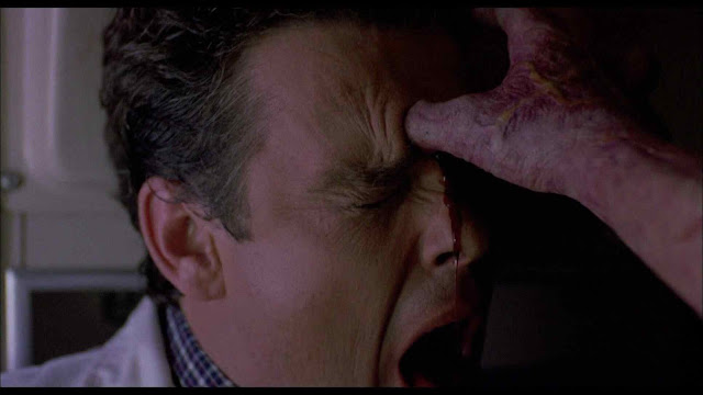
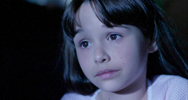
Let me just say that Michael is one strong son-of-a-bitch. Not satisfied with poking someone in the eye, he instead jambs his thumb through the unlucky man’s forehead. Cut to a young girl, perched on a couch. She’s the center of attention, here. Literally. The camera ever-so-slowly coasts towards her on a dolly. It’s almost imperceptible, like some of the dolly shots in Alien (1979). The scene, itself, is pure silhouettes, with the only light coming from the streetlights outside. Dwight H. Little and company really understand the look that made the original so evocative, and they shoot every scene for maximum effect. We’re given a portrait shot of Jamie’s face— glowing in the streetlights, while the shadows of raindrops run down her cheeks like tears. She has her uncle’s eyes, alright; they’re black as pitch.
The great thing about Halloween 4 is that it toys with the audience, without feeling cheap or confusing. Early on, Jamie is visited in her dreams by the Shape. This isn't an obligatory or chance reunion: Jamie is haunted by an ambiguous presence. At first we think it’s real, and that Michael has returned to quickly kill his niece. This is a mistake many horror movies would make, but 4 decides to play with us, instead; it takes its time. We feel Michael even though we can’t see him. When there seems to be two of him in the scene, we realize that it’s actually a dream. We don't learn until later that the Shape isn’t Michael haunting her; it’s the evil within her that she’s afraid of, but feels attracted towards. When a movie plays with you, it requires some sleight-of-hand. You can’t realize the trick, too soon, or it won’t work, but you need to be aware of it, on some level. In short, you need to feel uneasy about what’s going on while still, in some sense, unsuspecting the film’s true aim. It’s certainly a balancing act, and it works as well as it does in the movie because Jamie is convincingly sweet. We don’t suspect her as something evil because her sweetness beguiles, but innocently. She doesn’t actively feel the call of evil, or channel it. She’s always scared, or in danger.
Jamie doesn’t murder cats or stare at the camera obviously like Damien, in The Omen (1976). Her being evil is meant to be a surprise, as is the revelation that the events onscreen, like the dream, were even intimations of inner evil, to begin with. It adds up in retrospect, without making Jamie feel uncanny and abject. We like her as a character, which makes the twist all the more shocking without feeling cheap. Everything else the movie offers is meant to mislead, but also suggest her potential, without making it feel front and center. While the costume she chooses is a perfect double of the younger Michael’s, from 1963, she seems unlike her uncle in every way. All the same, the presence is there, but what does it mean? It’s enough to keep you busy without overcomplicating matters.
Jamie makes a far more engaging child than Tommy did. At the same time, there is old-man Loomis, who provides a parallel arc alongside Rachel, this movie’s less-parental version of Laurie Strode. Laurie is dead; so is the father. Jamie is an orphan, and Rachel isn’t too keen on being a parent. She doesn’t want to babysit; she wants to go on an actual date, with someone Laurie wouldn’t have been caught dead with. She’s not one to reach for low-hanging fruit, though; Brady is easy on the eyes, but somewhat of a jerk. So is the sheriff’s daughter Kelly. Kelly and Laurie are friends, but Kelly is sleeping with the boy Laurie likes (Annie, in the original, sleeps with Paul, someone Laurie never mentions). It’s the same parts Halloween used, but recycled in a different arrangement (and if people want to knock this aspect of the movie, it’s no worse than the original was). It provides enough variety and small-town drama to contrast neatly with the Loomis arc and it works well. There’s more going on, but I never felt confused, lost, or bored. It sets the stage.
Read part two, here.
***
Persephone van der Waard is the author of the multi-volume, non-profit book series, Sex Positivity—its art director, sole invigilator, illustrator and primary editor (the other co-writer/co-editor being Bay Ryan). She has her independent PhD in Gothic poetics and ludo-Gothic BDSM (focusing on partially on Metroidvania), and is a MtF trans woman, anti-fascist, atheist/Satanist, poly/pan kinkster, erotic artist/pornographer and anarcho-Communist with two partners. Including her multiple playmates/friends and collaborators, Persephone and her eighteen muses work/play together on Sex Positivity and on her artwork at large as a sex-positive force. She sometimes writes reviews, Gothic analyses, and interviews for fun on her old blog; or does continual independent research on Metroidvania and speedrunning. If you're interested in her academic/activist work and larger portfolio, go to her About the Author page to learn more; if you're curious about illustrated or written commissions, please refer to her commissions page for more information.


